Elementor to Create an E-Commerce Website How to Use Elementor
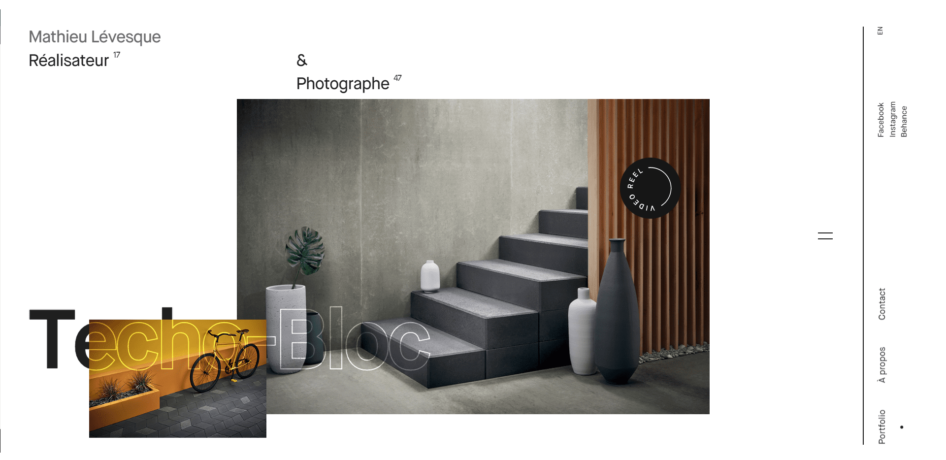
Embracing unconventional layouts with broken grids is a design trend that is gaining popularity due to its fresh and innovative style. This design technique involves breaking the traditional grid structure, creating a sense of chaos and unpredictability. By taking a step away from the norm, designers can create layouts that are engaging and attention-grabbing. The broken grid design can work well for a variety of content types, from magazine editorials to web pages. With the advent of responsive web design, designers can create layouts that adapt to different screen sizes, making this trend even more accessible. The key to successful broken grid design is to maintain cohesion and consistency throughout the design, even in the midst of the apparent chaos. This article will outline the benefits of embracing unconventional layouts and offer tips for effectively incorporating broken grids into design projects.

As a designer, you’ve probably heard of the grid system. It’s a tool used to create a visual structure in a design layout and helps guide the placement of elements on the page. But have you ever considered breaking the grid to unlock creative freedom?
A broken grid is exactly what it sounds like – a design layout that intentionally deviates from the standard grid format. This approach can add visual interest, create a sense of movement, and allow for more flexible and organic placement of design elements.
However, breaking the grid is not always easy and requires a solid understanding of design principles. It’s essential to make intentional choices with placement, spacing, and alignment to avoid creating a messy or confusing design.
In a world where we are bombarded with information and images 24/7, it’s essential to make your design stand out from the crowd. This means shaking off the traditional expectations of layout and composition, and taking risks to create something entirely unique and different. By doing this, you can grab the viewer’s attention, and make them stop and take notice of what you’re offering.
While designing, it’s important to keep in mind the website’s user experience, and the designer must cater to the target audience’s preferences and needs. Assuring that the design is SEO-friendly and optimized for search engines is also essential for the website’s success.
Design innovation is all about pushing the boundaries and breaking free from the norm. One way to achieve this is by exploring unconventional layouts in design.
Unconventional layouts present an opportunity to capture the viewer’s attention by presenting information in an unexpected way. It’s an excellent way to create an emotional connection with your target audience and convey your brand message in a unique and memorable way.
When attempting unconventional layouts, it’s important to do so with purpose. This means understanding your target audience and ensuring that the layout chosen is easy to navigate and understand.
When executed well, unconventional designs can create a powerful impact; it shows that your brand is willing to take risks and challenge the status quo. Not only does this attract attention, but it also creates a sense of excitement and curiosity that can encourage engagement with your brand.
Exploring unconventional layouts in design can be a powerful tool to create an emotional connection with your target audience and convey your brand message in memorable and impactful ways.
Broken grid design is a trend in web design that has emerged in recent years. This design style takes the traditional grid layout and breaks it in a non-linear and unstructured way. It can be used to create stunning and dynamic designs that capture and hold the attention of visitors to your website.
Broken grid design allows for more creative freedom in the placement of elements on a page. It can be used to create striking visual contrasts, highlight certain elements or simply add an air of unpredictability and excitement to your website. This style can be applied to almost any type of website, from blogs and portfolios to e-commerce stores.
The artistry of broken grid designs lies in the fact that it requires an eye for balance and proportion, as well as a deep understanding of the rules of design. It is a style that requires creativity and an ability to think unconventionally, but when executed correctly, the result is truly stunning.
Broken grid design is a powerful tool that can bring life to any website. It is an art form that requires a balance of creativity, skill, and a deep understanding of design principles. So, why not explore the artistry of broken grid designs and make your website stand out from the rest?
In design, traditional layouts are often considered the safest and most effective option. But what about when you want to break the rules and create something unconventional? How do you balance form and function to reach a harmonious outcome?
The key is to start with a strong foundation. Regardless of the layout, the content should be well-organized and easy to navigate. Use hierarchy to guide the viewer’s eye and establish a clear visual flow.
Next, consider the impact of negative space. Unconventional layouts often utilize negative space in unique ways to create contrast and emphasis. Play with scale, orientation, and alignment to find a balance that is both interesting and easy to read.
Finally, don’t be afraid to experiment. Test out different ideas and get feedback from others. You may be surprised at how a seemingly chaotic layout can come together to create a beautiful and effective design.
In summary, harmonizing chaos requires attention to detail, a willingness to break from tradition, and the ability to find balance in the unexpected. With these strategies in mind, you can create designs that stand out while still fulfilling their intended purpose.

Author

Elementor to Create an E-Commerce Website How to Use Elementor

Essential Elements of Painting Company 5 Essential Elements of Painting
Ananass offers professional web design services for businesses, delivering visually stunning and user-friendly websites. Whether it’s a new project or a revamp, our experienced team is dedicated to fulfilling your specific requirements. We believe in open communication and collaborative partnerships. For technical support, inquiries, or discussing your project ideas, our responsive and knowledgeable staff is committed to providing prompt and reliable assistance. Contact us today and let’s embark on a successful web design journey together.
Nous sommes ravis de vous accompagner dans la création de votre site web.