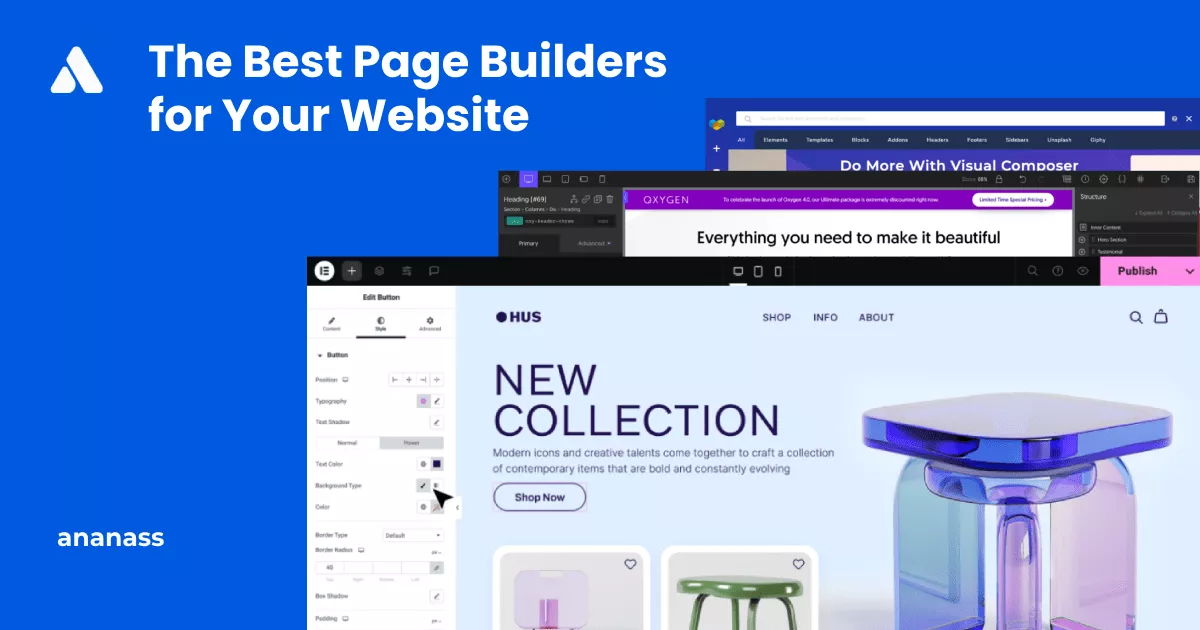
The Greatest Website Page Builders: Making Beautiful Pages Simple Having
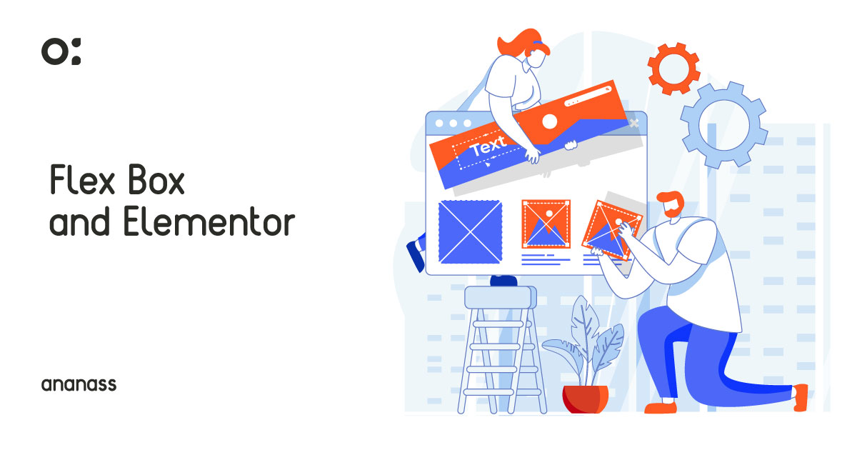
When it comes to creating stunning layouts that are both flexible and responsive, the use of Flexbox is essential. This comprehensive guide will walk you through the power of Flexbox and its impact on layout design. With Flexbox, designers can easily align and distribute content on both the horizontal and vertical axes, while maintaining control over the size and placement of elements within a container. Let’s delve into the world of Flexbox and explore its numerous benefits and applications.

To harness the power of Flexbox, start by declaring a parent container as a flex container using the CSS property “display: flex”. Once established, you can add flex items within the container and utilize properties such as “justify-content” for horizontal alignment and “align-items” for vertical alignment. Additionally, you have the flexibility to adjust spacing and order items to suit your design needs.
Flexbox finds its application in various layout design scenarios, including navigation menus, grid layouts, and responsive designs. It enables the creation of equal-height columns, efficient handling of overflow, and adaptive alignment and spacing for different screen sizes. For example, it excels at constructing responsive grid layouts that automatically adapt to changing screen dimensions.
Elementor, a popular WordPress page builder, seamlessly integrates with Flexbox, offering users a user-friendly interface to implement powerful layout design. With Elementor, even users with limited coding skills can easily incorporate Flexbox into their designs, unlock advanced layout options, and achieve beautiful, responsive layouts.

Author

The Greatest Website Page Builders: Making Beautiful Pages Simple Having

Top 10 Web Hosting Providers: Your Ultimate Guide to Finding
Ananass offers professional web design services for businesses, delivering visually stunning and user-friendly websites. Whether it’s a new project or a revamp, our experienced team is dedicated to fulfilling your specific requirements. We believe in open communication and collaborative partnerships. For technical support, inquiries, or discussing your project ideas, our responsive and knowledgeable staff is committed to providing prompt and reliable assistance. Contact us today and let’s embark on a successful web design journey together.
Nous sommes ravis de vous accompagner dans la création de votre site web.